Spring is the time when nature wakes up. Sunlight becomes stronger and days are getting longer and warmer. It is a big change for all of us. It is not only time for new beginning but can also be a threat. With my work I am expressing my concern towards fragile nature by composing a Polar Bear laying on ice while strong sun rays are melting his living territories. Evaporating organic shapes of water gives its last shimmer in bright colors. Partially violent outlines of the bear in black and orange create contrast and illustrates distressed state of nature, last moments of Polar Bear.
This animation is the very first, of which I have ever created. It’s already 3 years old but I never publish it, I guess I felt too shy. It is based on my similar painting, which you can view here. My attention was to make the artwork alive, show a little glimpse of Polar Bears last moments. The theme of this artwork is quite sad but unfortunately that is the reality of Polar bears at the moment. You can read more about them here.
This Essay is part of my MA Art and Design (Illustration) research on Illustrating music. It discusses the relations between musical aspects and artworks. By artwork I am referring to visual presentations such as drawings, illustrations or paintings. The thread of this paper is to explore territories of illustration and music in ways to deepen the understanding of how visual mark making corresponds to aspects of music.
I have noticed that motives of using musical aspects in paintings vary. As I described on earlier post, there can be seen the fashion when the impetus of music is based on the perception and structural studies of music as in Klee’s art. Alongside the settled classical music notation structures of counterpoint and polyphonic music that Klee explored in his practice, a new way to depict music developed in the first decades of the 20th century. That is, on the third part of the essay I’m introducing two music scores of which give an idea of ways of depicting music. At first I’m presenting a visual music score December 1952 (1952) from Earle Brown; and secondly a visual listening score (1970) of György Ligeti’s (1923-2006) composition Artikulation (1958) from Rainer Wehinger.
———————————————————————————————————————–
The new approach concentrated on the requirements of musical developments, which was the main reason to abandon the original notation form and develop music notation in a more visual direction in the first decades of the 20th century. Ways of making, hearing and producing music changed gradually and so did the approach to notation. Development of electronic and aleatoric compositions required a new way of depicting music, which brought the visual music scores to light (Thompson 2006). Artists took inspirations from each other, that is the movements in the music world influenced the visual art world and vice versa. For instance, as Dennis (1966:14) has suggested that the way Schönberg constructed his music was inspired by Cubism movement. Having noted that, it is visible that the structure of music started to lose its importance in the sense it had remained in previous decades, which obviously affected visual arts as well as they treated the pictorial space differently. (Dennis 14)
Thinking about notation and visual music scores the relation is very interesting. As earlier described, traditional notation has been a standardized in music for centuries, and one could read it and use it as a language inside the practice. Regarding to visual scores, they don’t work the same way. As Bossis (2006) describe in electroacoustic music, the language is not standardized, which leads to the reason why individuals have their own methods to depict sounds and to the fact that perception is not that standardized either. (Bossis 2006) Sometimes one might not even know where the reading starts or ends. Due to that, visual scores are guidelines for performers and/or audience in order to gain understanding of complex music pieces and to depict subtle harmonies and timbers. In addition they look like pieces of abstract art and I would say, in one level, they are working like art.
Bearing that in mind I suggest that visual music scores are somewhere between notation and art, and in that sense it can be partly studied and explored as an artwork. The notion above might help to understand the relations of visual music scores and art. Now, have a look at December 1952, a visual music score from Earle Brown. At the first sight one may think how do the drawn lines work like music? The score consists of black horizontal and vertical lines with different thicknesses but apart of these facts it might be challenging to understand the message of the visual marking method. Regarding Rawson (1988;40) relations between visual units build a connection system in drawing. As Brown(2008) has mentioned, the score is not composed, rather it suggests the relationships between elements. The purpose of the December 1952 is to help a performer to improvise. In other words, it would help a performer to correspond with the elements and communicate through their own inner poetism, as Brown described.(Brown 2008) Indeed, these lines are not just random separately located black strokes, rather one has decided to construct them at specific places on the surface, leaving some space between the elements.
Brown (2008) has described loosely how to read the particular score. He suggested that top of the page represents the higher register of instrument and with the same logic bottom page stands for the lower register. Left-right scale is suggested to be time, and the size of the lines indicates the volume of the sound. The line thickness is also suggested to indicate cluster sound, which basically means that many closely occurred tones should play at the same time. Brown also suggested imagining the sheet as a three dimensional space where the elements would physically move with different speeds in different directions in front of the performer. That is, the performer would connect to the physical movements and would improvise by perceiving the suggested relationships which are given from the elements movements. (Brown 2008:4-7)
In that light, reflecting to the guidelines and looking at the image, the first description would seem to quite obvious but it is quite challenging to gain the understanding of 3D form just by looking at the Brown’s work. However, whether it is 2D or 3D, it is clear the relations between lines plays the key role. The way the lines are organized is very standardized and reminiscent of small rectangles. Some of the lines are closer to each other and create line groups, and at the same time lines bridge the gap with other line groups and so on. They create a rhythmic body structure. Even the score is for improvisation, and in that sense it would be assumed that the structure is free. I can recognize the same strict and absolute appearance of music structure in the way lines are executed as it is in Klee’s work in the form of colour blocks. The main difference is that the expressive aspects, the poetic part Brown mentioned, are left outside for a performer, as the work is not a painting but a score.
Going further, and analysing another music score Artikulation (please see below video). The main difference between Brown’s score and his is that it is made to support the perception of the music piece. Certainly, it is called a visual listening score. The score illustrates Hungarian composer György Ligeti’s electronical composition Artikulation, which Wehinger created in the 1970’s. The listening score is based on the aural impression of the piece. It is a visualization of the sonic texture and the musical structure, and the purpose of this score is to give the idea and illustrate the music piece for an audience. (Guardian 2013; Thompson 2006; Levy 2006) Wehinger’s score is originally made on paper sheets. On the presented video music is synchronised with the score. The piece lasts almost four minutes, and to follow the score the black vertical bar is added afterwards to indicate the current position of listening (Graig D 2007; Northern 2009) It is vital to mention that Ligeti’s electronic piece is a whole composition when Brown’s was a guide for improvisation.
Rawson (1987;36) mentions that all forms of drawing should be reviewed in two ways. Firstly it is vital to understand that units and systems of the drawing carry emotive and associational contents. Having heard Ligeti’s electronic music piece I agree that shapes corresponds to the heard sounds on one level. I perceive that the round shapes sounds like soft bubbles and the combs create the illusion of sharp undulating movements. However, perception can be argued. Shapes also create other associations, which may not be that direct. To analyse the score, it is relevant to note that Ligeti’s piece was made in the 1950’s, but the score were created two decades after, which is seemingly recognizable of its typical visual language. Different shapes and colours mirror the time, for instance, bright colours and geometrical shapes, but also round organic shapes in the background, depict design from the 70’s. As a reflection to Rawson, this perception of time can evoke feelings, perhaps memories, which one can link to past. It seems to me that in a way the forms and shapes carry the meanings, of which I would argue the particular music piece wouldn’t evoke alone.
The second point of reviewing forms of drawing is connected with the structural function of methods used. Rawson states, structural function enables the work to be related to system. (Rawson 1987:36) Wehinger’s score not only concentrates on depicting the timbers but also illustrating the structure of composed music and it’s progress with the same logic as an original notation, where time is suggested to pass from left to right, and due to that overlapping elements on the surface are indicating sounds playing at the same time. It can be seen that the pictorial space of the surface is framed with a black stroked square, in which all the musical elements are situated. Time is indicated outside of the square with numbers and measure lines. Wehinger created a system for a score, which is divided in four element categories; a music score consists of a mix of geometric, colourful elements. Regarding Northern (2009) dots are indicating impulses, combs illustrate noises and colours are representing values and variations in timbre and pitch.
Adorno and Gillespie (1996: 69) mention that one often thinks that space in paintings is the same as time, nevertheless they don’t share directly the same identity; temporal organization is not simultaneous but successive. When considering the rhythm, Langer (1967) and Adorno and Gillespie (1996: 69) describe, it as something which prepares the future. It is one group of tensions after another. Thus time is an immanent aspect and its embodiment is carried out with rhythmical marks, which constitute the space. Certainly, to support this opinion Rawson (1988: 200) also states that rhythmic marks are signals for audience to read surfaces; they create relations between elements of positive surfaces and ‘empty’ negative voids. To understand this, it is good to have closer look at elements in the score. For instance, the elements in green squares attached with green undulate lines not only suggest sound development, but also give an idea of time. In addition, repetitions of elements create rhythm in pictorial space, and on other level indicate that the same sounds are repeated in the music piece.
———————————————————————————————————————–
The main idea of this essay was to get an insight of the relations between musical aspects and artworks. The approach was to research visual mark making and how they correspond to music. This essay introduced some of the qualities of both art forms by searching for how they are connected and correlated with each other. To understand the fundamental aspects, it was vital to have a look at the territories and get an insight into how both are operating. It may be obvious that the connection is as simple as they both evoke feelings using human senses such as hearing and sight. However, as it mentioned earlier, feeling is an outcome of a complex and subtle language system both practises have. The communication factors differ a lot from each other, which make sense, as they are different art forms. Nevertheless, music and visual arts have interacted for centuries and artist have depicted musical aspects in their works in many ways.
Paul Klee’s work Alter Klang illustrates the outcome of the enquiry he had gone through while finally developing the colour block composition system. Klee used the musical polyphonic structure as a base for his working methods, which he extended and applied to other painting themes. Rich colour tones combined with square grid suggested that the strict music structure could be combined with expressiveness in painting. The un-figurative composition form proposed the method where the music and painting unite the purest way.
As the way of making, hearing and producing music developed in the first decades in 20th century. The impetus of new music developments changed the way of visualising composed music, as normal standardized notation could not meet the requirements of depicting pitches or sounds anymore. Visual music scores replaced partly the original music scores in the new music genres. Even the visual music scores are guidelines for understanding music the elements and shapes are more iconic and thus they share the language with visual arts.
Visual communication rules are more flexible than a normal notation system. When one is aware of the ways a visual communication operates, visual scores are a workable tool for the purpose of depicting and illustrating sounds as well as understanding the structures of musical pieces. Brown’s and Wehinger’s music scores showed how music can be depicted many ways and how pictorial space can work differently. Browns score revealed how simple lines work in order to create relations between each other and shape the whole pictorial space. On the other hand Wehinger’s listening score showed how shapes and colour create rhythm on surface, and how repeated lines can create the sense of time.
Bibliography:
Adorno T. W. & Gillespie S. ‘On Some Relationships between Music and Painting’. The Musical Quarterly.79(1 )(Spring, 1995), pp. 66-79. Available at: http://www.jstor.org/stable/742517 [Accessed 15 April 2015]
Allard J. C. (1982) ‘Mechanism, Music, and Painting in 17th Century France’ The Journal of Aesthetics and Art Criticism. 40(3) Spring, pp. 269-279 Available at: http://www.jstor.org/stable/429683 [Accessed 15 April 2015]
Arts Counsil (1986) Eye Music –The Graphic Art of the New Musical Notation. A Catalogue. London: Arts Council of Great Britain
Bossis, B. (2006). ‘The Analysis of Electroacoustic Music: from sources to invariants’. Organised Sound, 11(2). August. pp 101-112
Brown E (2008) ‘On December 1952’. American Music. 26(1) Spring. pp.1-12 Available at: http://www.jstor.org/stable/40071686?Search=yes&resultItemClick=true&searchText=On& searchText=December&searchText=1952&searchUri=%2Faction%2FdoBasicSearch%3FQuer y%3DOn%2BDecember%2B1952%26amp%3BSearch%3DSearch%26amp%3Bwc%3Don%2 6amp%3Bfc%3Doff%26amp%3BglobalSearch%3D%26amp%3BsbbBox%3D%26amp%3Bsb jBox%3D%26amp%3BsbpBox%3D&seq=1#page_scan_tab_contents [Accessed 1 April 2015]
Craig D. (2007). Rainer Wehinger’s Music Score of Ligeti’s Articulation. Available at: https://www.youtube.com/watch?v=71hNl_skTZQ&index=16&list=PL377912D603DB058B [Accessed 2 March 2015]
Dennis B. (1966) ‘Metamorphosis in Modern Culture: The Parallel Evolution of Music and Painting in the Twentieth Century’. Tempo.78. Autumn pp. 12-21. Available at: http://www.jstor.org/stable/942503 [Accessed 15 April 2015]
Gale, M. (ed.) (2013) Paul Klee: Making Visible. London: Tate Publishing
Guardian (2013) Graphic Music Scores –In Pictures. Available at: http://www.theguardian.com/music/gallery/2013/oct/04/graphic-music-scores-in-pictures#/?picture=418979770&index=9 [Accessed 7 April 2015]
Halliday S. (2013) Sonic Modernity –Representing Sound in Literature, Culture and the Arts. Edinburg: Edinburg University Press Available at: http://herts.eblib.com/patron/FullRecord.aspx?p=1173642&userid=her.61487100a7fb0d22 &tstamp=1429670452&id=f117b307496e0e03efe3ef0d94e14767bc5bb311&extsrc=ath-usr [Accessed 1 April 2015]
Kahn D. (1999) Noise Water Meat –A History of Sound in the Arts. London: The MIT Press Kandinsky W. (1979) Poin and Line to Plane. New York: Dover Publication
15
Kandinsky W. (1947) Concerning the Spiritual In Art. Baltimore: Monumental Printing
Kagan, A. (1983) Paul Klee/ Art & Music. Cornell University Press
Henry M. (2009). Seeing the Invisible on Kandinsky. London: Continuum
Ingold, T. (2010) ‘Ways of mind-walking: reading, writing, painting’. Visual Studies. 25(1 )April. pp. 16-23.
Langer S. K (1967) Feeling and Form –A Theory of Art. London: Routhledge & Kegan Paul Limited
Levy B. J. (2006) The electronic works of György Ligeti and their Influence on his later style. PhD Dissertation. Available at http://drum.lib.umd.edu/handle/1903/3457 [Accessed 7 April 2015]
Northern K. (2009) Artikulation With a Visual Score. Blog. Avalable at http://www.phidelity.com/blog/phidelity/music/music-news/artikulation-with-visuals/
[Accessed 15 April 2015]
Malinowsky (2014) https://www.youtube.com/watch?v=74Osn05UkU0
Morton M. & Schmunk P.L. (2000) The Arts Entwined: Music and Painting in the Nineteenth Century. Available at
https://books.google.co.uk/books?hl=fi&lr=&id=7NP724mFE1MC&oi=fnd&pg=PR7&dq=mus ic+of+painting&ots=Gm-muUSIVS&sig=HmLvNuwzk79KcRiAI2UIq2- mJ_o&redir_esc=y#v=onepage&q=music%20of%20painting&f=false [Accessed 10 April 2015]
Osborne R., Sturgis D., &Turner N. (2006) Art Theory For Beginners. London: Zidane Press
Rawson P. (1987) Drawing. Philadelphia:University of Pennsylvania Press
Vella T. (2000) Sounds in Space Sounds, Sounds in time. London: Boosey & Hawkes Music Publisher
Smalin (2014) Youtube page of Stephen Malinowsky. Available at: https://www.youtube.com/channel/UC2zb5cQbLabj3U9l3tke1pg [Accessed 2 March 2015]
Thompson J. (2006) Part One. Aesthetic and Technical Aspects Integral to the Composition of Sonofusion: for Overtone Violin. Part Two. Portfolio of Compositions. Availabke at: https://books.google.co.uk/books?id=UES_cngeKn4C&printsec=frontcover&hl=fi&source=gb s_ge_summary_r&cad=0#v=onepage&q&f=false [Accessed 15 April 2015]
Toop D. (2005) Haunted Weather -Music, Silence and Memory. London: 5-Star Edition
Stelter, M. (2013) Illustrating music. Video. Avalable at http://vimeo.com/49756473 [Accessed 2 March 2015]
This Essay is part of MA Art and Design (Illustration) research on Illustrating music. It discusses the relations between musical aspects and artworks. By artwork I am referring to visual presentations such as drawings, illustrations or paintings. The thread of this paper is to explore territories of illustration and music in ways to deepen the understanding of how visual mark making corresponds to aspects of music.
The main focus point of this essay is painting, where music is an important inspiration and source of methods used in the art works. I introduce the topic through three visual presentations from different decades of the 20th century as follows: A painting from Paul Klee (1879-1940); Alter Klang (1925), a visual music score from Earle Brown (1926-2002); December 1952 (1952) and a visual listening score (1970) of György Ligeti’s (1923-2006) composition Artikulation (1958) from Rainer Wehinger.
Concerning any arts, general challenge is in defining relations between them. Indeed, together music and visual arts have been under observation and discourse for centuries. In fact, painters such as Klee, Delaunay, Kandinsky, and composers such as Debussy, Schönberg and Stravinsky, were alternately under the influence of each other, and took the inspiration and explored the concepts of art mediums to seek and identify structures and forms in their own practices in 19th and 20th century. However, one might ask, why or how should we find the relations between different arts, as it might be obvious music and painting are different? Yes, they are different in sense that the content that music expresses alone differs from painting; music’s sensory content is sound whereas the contents of painting are colour and forms for traditional thought. (Morton & Schmunk 2000; Dennis 1966)
Thinking about the fundamental characters of music, there are other aspects we should point out. Music is something invisible, which operates through our sense of hearing; basically it is sound waves, which are repeated clutters of air particles; our eardrum response them and translate them into electronic signals and then send to the brain for decoding (Vella 2000: 38). We can also consider music as temporal art where it has it’s realm or existence in time territory. Having mentioned that, it is relevant to note that it has an appearance outside of time as well, for instance, in the form of notation. (Adorno & Gillespie 1996)
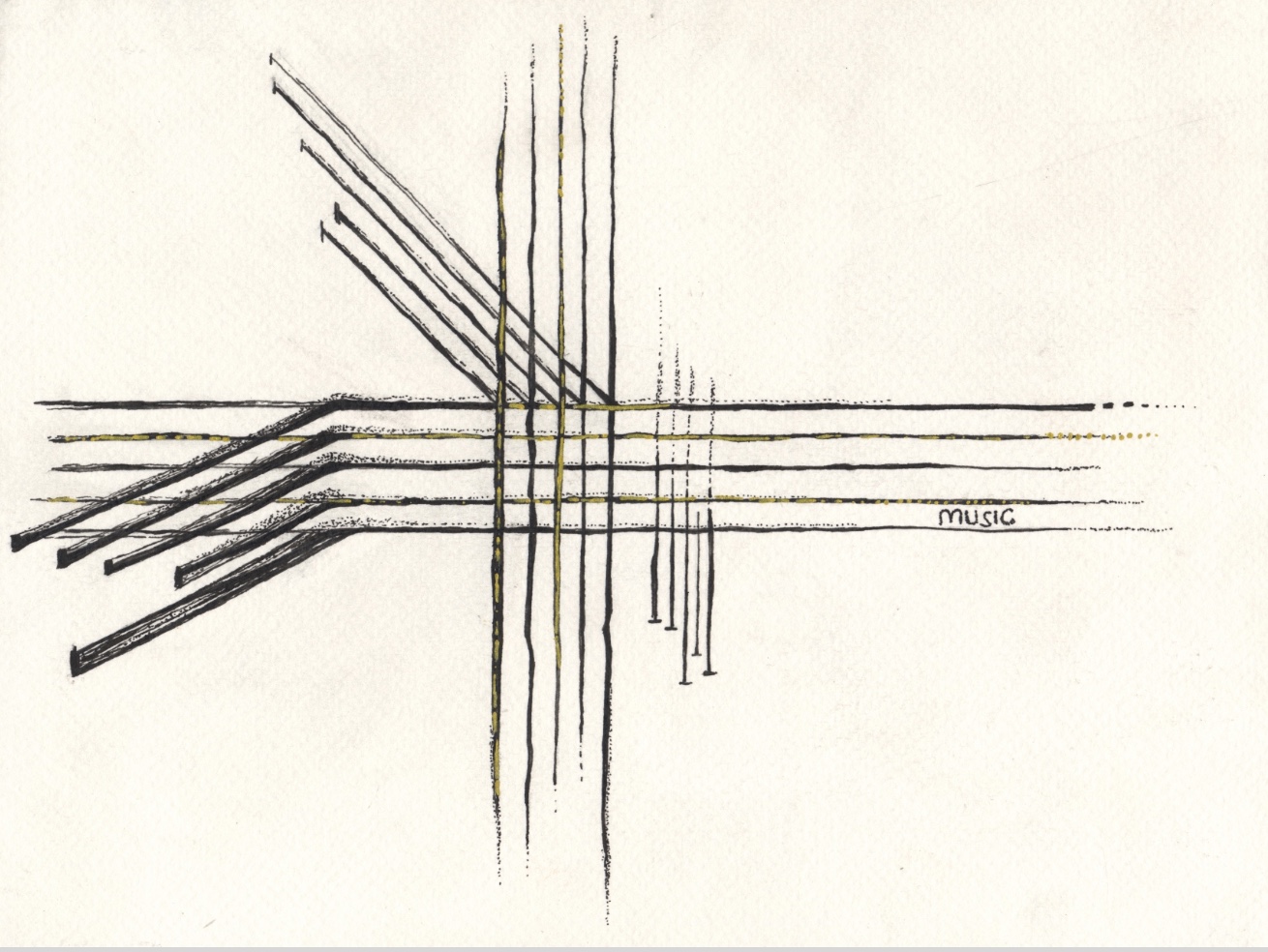
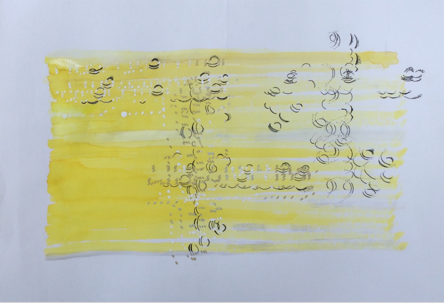
One of my experiment where the notation is taking out of context. Watercolor and Fiber-tip pen on 200g Paper, A5
Going forward and describing fundamentals of visual arts, unlike music, a painting works using two-dimensional space, which can be characterised as a spatial art. A painting is a static simultaneous object, which consists of elements that exist next to each other in surface space. It is a reworking of a space, and the creation process is carried out in time. In order to create lines of drawing one will create movements of points. Indeed, in ways how lines are organised, form elements on surface. (Rawson 1987; 15) (Adorno & Gillespie 1996; 66-69)
What explains relations between music and painting? We relate to things through the different senses, and we create the reality combining the information we receive through them. We don’t distinguish between senses of the world such as taste or touch, they are working together. Music and painting works through different senses, hearing and sight, but at the same time they share something, that is feeling. (Henry 2009) In other words, both the visual and audible perception evokes feelings. As Halliday describe, arts echoes our own subjective life. It reflects our feelings (Halliday 2013, 22).
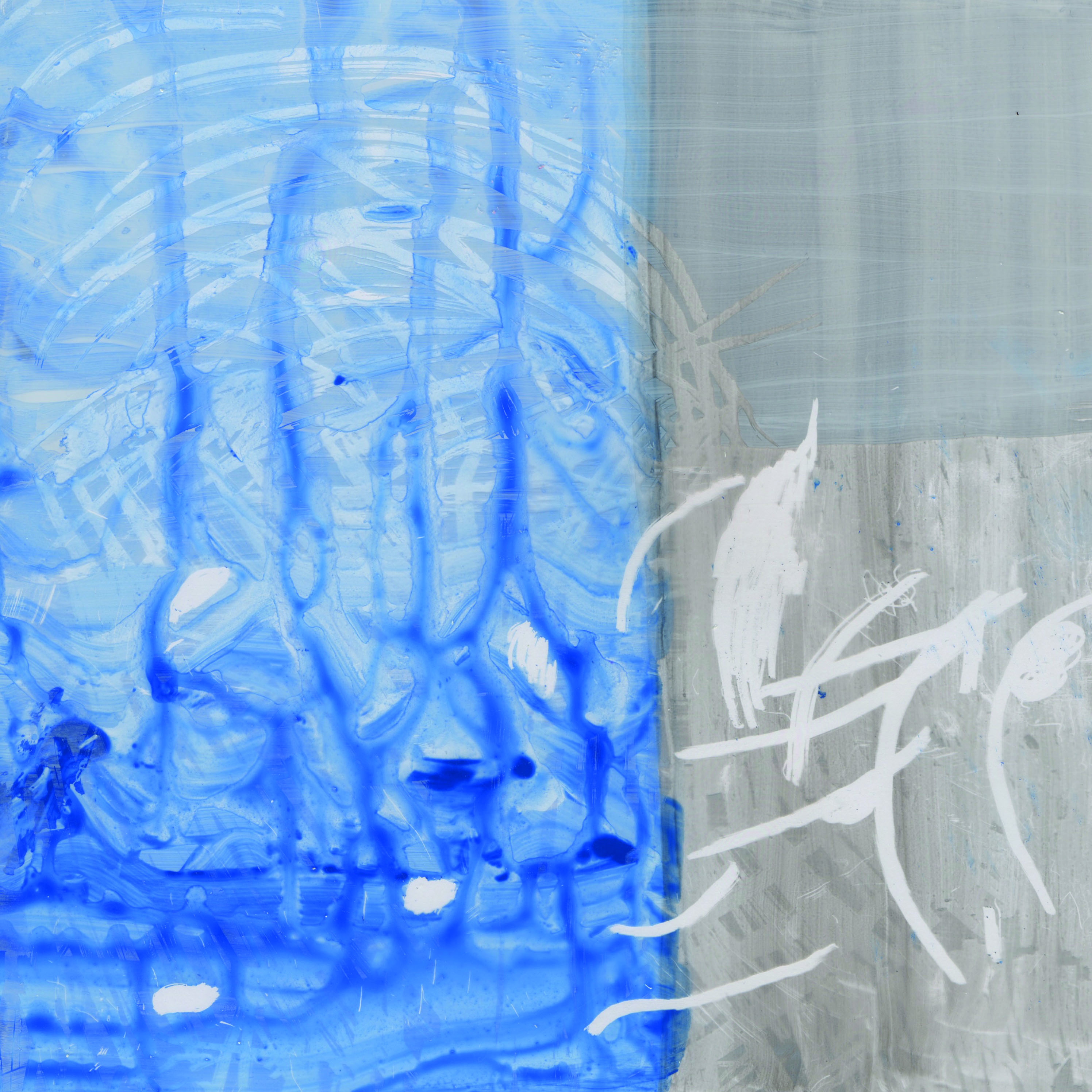
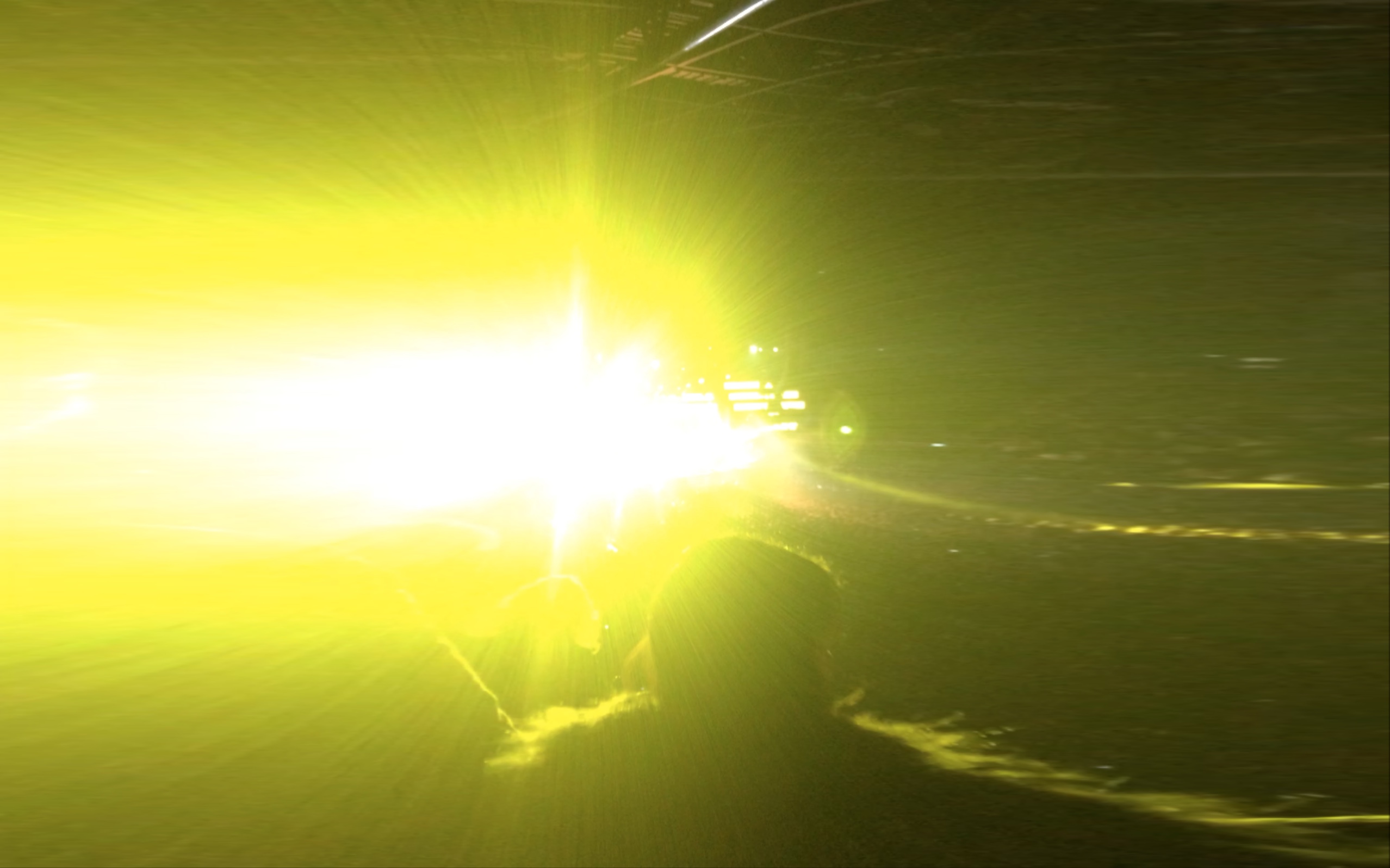
An experiment; light vs. shadow: reflection. Acrylic paint on acrylic sheet.
But the true connection between music and visual arts is not feeling, rather it is the outcome. The connection can be found profoundly with their language. It’s not the language in the sense of linguistic terms. As it may be obvious music and visual arts share a lot of vocabulary together, for instance, tones of music and colour, or rhythm in music and paintings. (Dennis 1966). Even though these disciplines share the same words; it does not exactly mean the same aspects. The both have their own characteristic way to convey messages.
Music and painting speak the language of how they are constructed. That is, the connection, the fundamental, is how the space, temporal or spatial, is planned, organized and used. However the methods used in music differ from those used in painting; when music deals with different pitches, melodies, harmonies, which are carried out in different rhythms and with different instruments, paintings use different colours, strokes, shapes with different materials and surface sizes. (Adorno & Gillespiel 1996:71) In other words, music and paintings have their own methods. Indeed, Adorno and Gillespie (1996:68) and Rawson (1987:195-197) suggest that operating with individual colour qualities means the same thing that composers operate with individual tones. And these methods are the base for the language that has arisen and the feelings that are evoked from artworks.
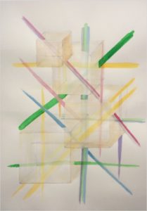
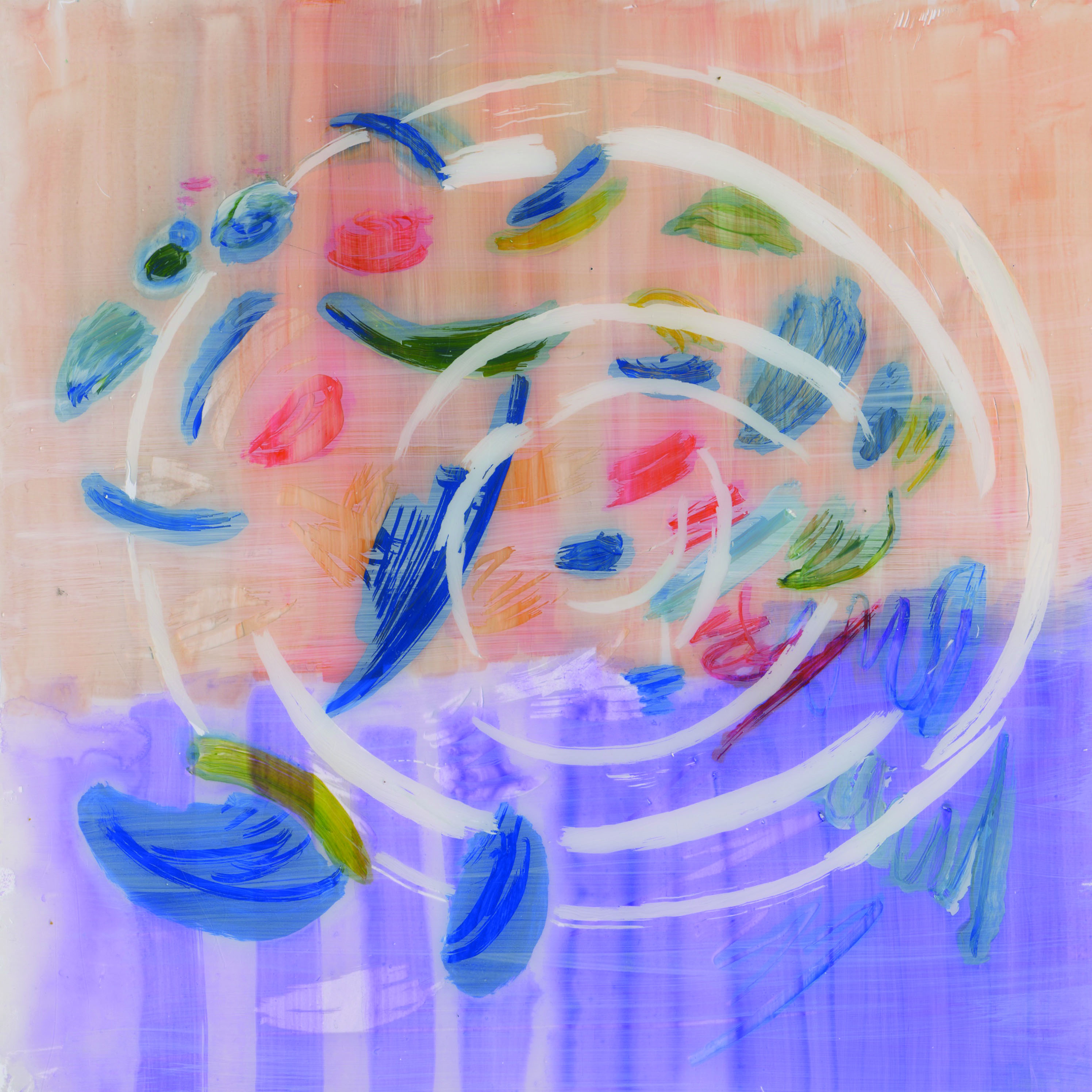
Tracking musical structures. Watercolor and pen on 300g paper, A1
I found this interesting video, again from the Slow Mo Guys. In the video Gavin Free and Dan Gruchy record a slow motion film of a speaker, which is covered with paint. They literally paint the music. As music plays paint drops vibrate and jump along with the music. They are using a high speed camera, which shows the world hundereds of times slower than normal eye can see. It looks amazing how rhythms shape the colourful paint drops.
I think, this is very inspiring, as it gives me totally different insight into ways of painting music. Could I illustrate music in slow motion, and how? Maybe I could concentrate on fine structures of sounds and try to bring alive the present; investigate the ‘nowness’ of music.
“Color is the keyboard. The Eye is the hammer. The Soul is the piano with its many strings. The artist is the hand that purposefully sets the soul vibrating by means of this or that key”.
The sentence above was written by Kandinsky. It’s from Tim Ingold’s article (Ways of mind-walking: reading, writing, painting), which I mentioned in the former post. Concerning painting music Ingold mentions that Kandisky had characterised how music and painting music “…open the mind to inner thruths…“. Ingold described how Kandinsky took inspiration from the composer Modest Mussorgsky’s piano composition Pictures at an Exhibition (1874). Kandisky used the same name for his own exhibition in 1928. In turn Mussorgsky had taken inspiration for the composition from his friend Viktor Hartmann, the Russian artist and architect. I think it’s fascinating how Hartmann’s works have transformed to music, and later to abstract art pieces.
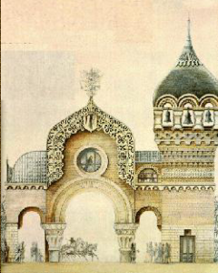
To illustrate the transformation I searched for one of `the exhibition´ works. The below image (picture 1) presents the painting called The Great Gate of Kiev, by Hartmann. Originally Hartmann’s work was for the competition, where he was commissioned to design the great gate in memory of the 4th of April in 1866, when Tsar Alexander II survived an assassination attempt, and escaped to Kiev (Stmoroky 2000). However, the project was cancelled and Hartmann wasn’t recognised for this work in his lifetime. After he had passed away Mussorgsky composed the piano suite mentioned above, and he named the pieces after Hartmann’s works. (Ingold 2010) The last `picture’ of the exhibition suite was named after this event. Later Kandinsky painted his own version of the same theme (picture 2).
You can listen to Mussorgsky’s piano piece The Great Gate of Kiev here.
1. Hartmann; The Great Gate of Kiev (Stmoroky 2000)
2. Kandinsky; The Great Gate of Kiev (Wikiart 2014)
Bibliography:
Ingold, T. (2010) ‘Ways of mind-walking: reading, writing, painting’. Visual Studies. 25(1 )April. pp. 16-23.
I have recently looked for different kinds of ways to illustrate or track music. Besides ‘normal’ notation here are some other methods I have found.
Martin Shelter is an interaction designer based in Berlin Germany. He has created a method, as part of his bachelor thesis, to depict music. There are some screenshots of the video below. As a whole the video can be seen here.
Another example is Rainer Wehinger’s visual listening score of Romanian composer Ligeti’s Articulation, which can be seen here. I found this one very eye opening for Ligeti’s music. I think it illustrates brilliantly the different sounds and sensitive structures of the piece.
I also found a book about Paul Klee (Kagan, A. (1983) Paul Klee/ Art & Music. Cornell University Press). I recommend to have a look at it if you are interested his interpretation of painting music.
Below you may see my versions on creating musical pattern
Media: pigment ink on magazine page, A4
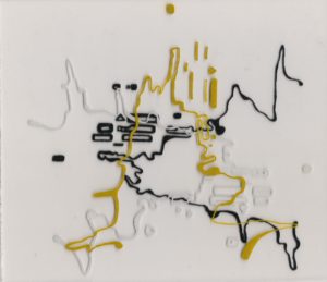
Media: Pigment ink on layered acrylic sheets, 20×18 cm
Bibliography:
Kagan, A. (1983) Paul Klee/ Art & Music. Cornell University Press
One of my colleagues recommended I watch a video of cyborg artist, Neil Harbisson, who can actually listen to colors. He has been color blind most of his life but since 2004 he got a color sensor. The sensor changes the colors to audible frequencies through a chip which is installed at the back of his head in the bone. He can not only interpret the spectrum of colors but the color ranges out of human sight too.
I think it is unbelievable how he can distinguish the differences between color tones, and if he can hear so many tones of colors it’s amazing that he can compose based on that. Obviously he must be very talented in music as he can hear the differences between microtones. In the video he is explaining that when he enters to a shopping mall his head is full of different sounds as he interprets the surrounding activities.
Here’s a song he has composed based on the colors of fruits. I think this gives a good idea how he colors are matching to sound frequencies.
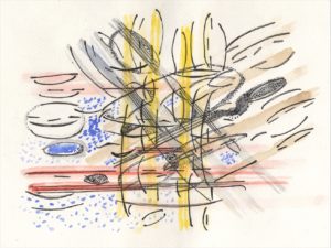
I’ve been thinking about how the symbols on music sheets can look quite monotonous but they actually conceal another dimension. I think, individually the notes are just notes; signs of certain frequencies and times. However when we are playing them, the notes are interacting with each other and creating harmonies. If I am thinking about music in a space, I feel it is flowing around us. Nevertheless, it’s written in a formal sheet that one can read and play; it starts at top left corner and usually ends at the bottom right corner of the sheet. It’s quite amazing how music has its own written language, and whoever can translate it is able to experience and share it.
With the sketches below I try to reflect these ideas. I chose the piano piece Clair de Lune from the French composer Debussy, simply because I like the piece and piano compositions are close to my heart. As I did in the former post “Bringing the background music in front”, I searched for the music sheet, and using the light box I copied some of the staves, slurs and ties. I used black fiber tip pen to draw the notations from the music sheets on paper. I layered and drew them in different directions, to illustrate the interaction of sounds. The applied watercolors describe aspects of the music we cannot see: harmonies, evoked feelings, and the propagation of the sound waves.
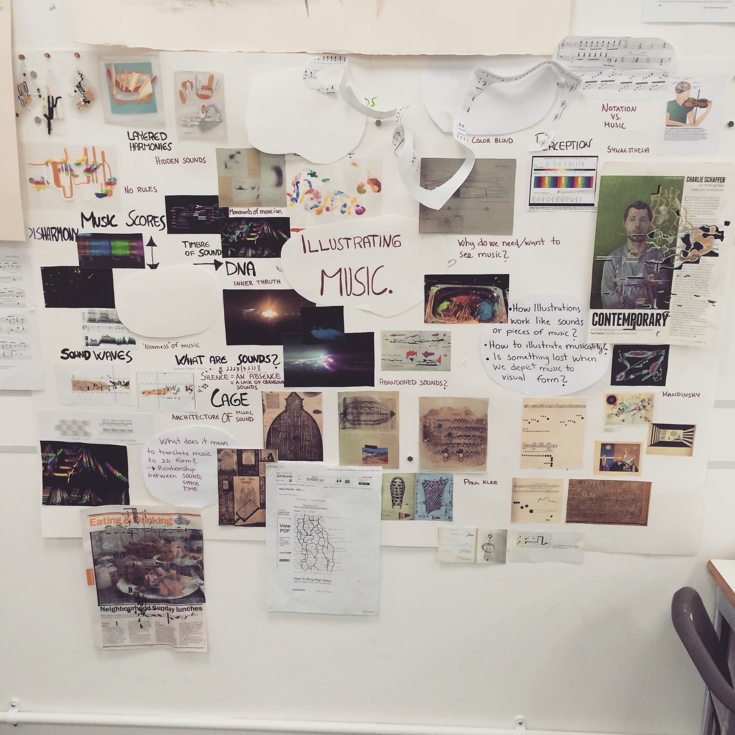
By the end of November, I had arrived at the point that I wasn’t sure if I wanted to continue my research of visual culture and visual communication anymore. I was focusing on the visuality of fashion and clothing as I was aiming to become a fashion illustrator. Don’t get me wrong, I found fashion illustrations interesting, but finally I wasn’t sure was that the field I wanted to spend my next 9 months with. After some weeks of digesting all of this, and having conversation with my tutors, I came up with the idea to start exploring ways to illustrate music. Changing the research subject was a good decision, aside from the fact that almost two months of my first semester had past already. The new subject of my research is an extremely interesting and challenging area of study, and now as a reflection I would like to present some ideas I have come across with the research process so far. However, as fashion is still close to my heart I am not going to abandon it. I want to take a break from it, and throw myself into music now.
I started the research thinking of my own experience of music, and moved forward to exploring the field in order to gain a broader understanding of it. Very roughly there seems to be two kinds of approach to the phenomena. One is based on the perception of the artist, and the second one is based on music theories or the requirements of composed music. Let me explain this more. I find the first approach freer and, at this point, it is somewhere I have leant on my methods too. It is based on artist’s own experience of listening to music. I think that Kandinsky’s methods would be a good example of this. As I understand it, Ingold (2010) refers to Kandinsky that, in abstract art, artist works are not bound in objects from the visible world. On the contrary shapes depict ideas of things, not the actual objects. Due to this, one can express oneself in a way that touches the viewer’s soul truer. I would like to point out that this is only one part of his theories on abstract art, for instance a French Philosopher Michel Henry’s (2009) introduces Kandinsky’s theories broader including insights of theories such as External and Internal and the theory of elements.
Going forward, I see the second approach to music illustration as more technical and music theory orientated. I realized that illustrating music is not only about making art; it can be used as a tool as well. Regarding Bossis (2006), there are cases in electroacoustic music, where the complexity of a piece of music requires new ways to track sounds on music scores, as normal notation can’t meet these challenges. Electroacoustic music is lacking a settled way to mark scores as, for example, the timbre of sounds can vary so much. For instance, if shapes and colours in the score describe structures of timbre, symbols can be changed a lot between different compositions. I think that is the one reason why individuals have their own methods to illustrate sounds in the electroacoustic music scene, and maybe it can be said that there are as many scores as there are composers.
There are lot of music scores available on Internet. Just to mention some names, musician Stephen Malinowsky (2014), who has made music scores of known classical music composers’ pieces, uses his own developed Music Animation Machine to depict music. I think his music scores are made in a very standardised and clean way. On the contrary, Rainer Wehinger’s visual listening score of Ligeti’s electroacoustic piece Articulation (Donald Craig 2007), shows brilliantly how different structures of timbres and frequencies are illustrated in different shapes and colours. Also Kagan’s (1983) book about Paul Klee contains many interesting examples on music scores, and how he has developed his theory about it.
Thinking about the approaches, they both depict the music in their own ways. As an illustration student I see myself somewhere in between. I am amazed at Kandinsky’s works. And I find it so inspiring how he perceived music and translated it in visual form. Furthermore, if I only saw the music scores without hearing them, these works would remind me more of pieces of art than graphics of music. The idea that they are tools aiming to describe the structures of sounds, but at the same time visually appealing, attracts me; it is like a knitted jumper I mentioned in one of my blog posts. That leads me to think of my former research of visual culture in fashion and clothing. Could I have found some confluences or similarities, for instance between Kandinsky’s and Ronald Barthe’s theories? After all, it is all about perception.
Working on this theme has opened up some new painting methods, as before most of my illustrations were more or less portraits using media such as pen or watercolours. Recently I have started to think in a more abstract way about my illustrations, probably inspired by Kandinsky and Klee. I did some experiments thinking about music notations versus how I feel the music and how music interacts in space. I found the music score videos (Malinowsky 2014 & Donald Craig 2007) and the slow motion video about paint on a speaker jumping along with the music were inspiring, as the scale was totally different to what I’m used to. Moreover, this research topic forces me to think outside the box, as music is invisible, and you can experience it the strongest with sense of hearing. I’m looking forward to developing my style and exploring more viewpoints to further my research.
Bibliography:
Bossis, B. (2006). ‘The Analysis of Electroacoustic Music: from sources to invariants’. Organised Sound, 11(2). August. pp 101-112
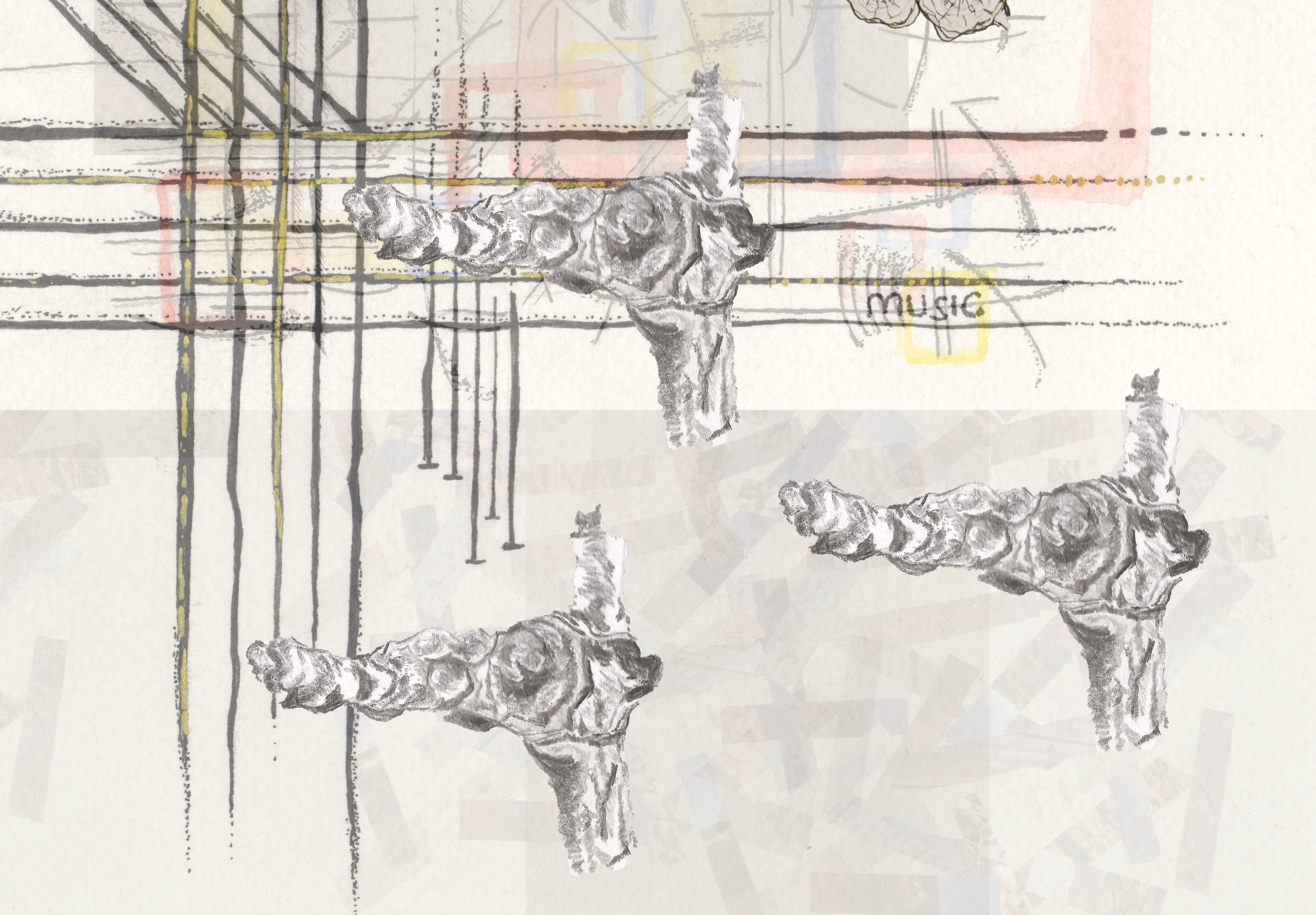
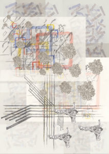
This is one of my posters I submitted for my MA project proposal. It summarizes my semester A findings and leads me to the research of Illustrating music, and is the starting point for the Practice 2 module, of which the main idea is to challenge me to explore the topic from different angles and find many different approaches. This poster illustrates the theme of layering the nature I came across in autumn. As I changed my research topic to music Illustration I finally realized, that as I perceive music, I think it is layered too; it is layered with different tones,timbres, sounds and frequencies in order to create harmonies and melodies.
Technique: Collage using Photoshop, A1
06 / 01 / 15
We use cookies to ensure that we give you the best experience on our website. If you continue to use this site we will assume that you are happy with it.
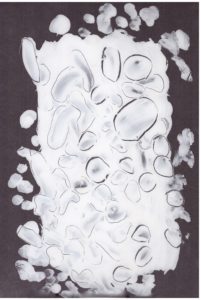
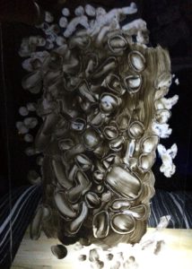
 An experiment; light vs. shadow: reflection. Acrylic paint on acrylic sheet.